Dplyr and Visualization
Brexit plot
brexit <- read_csv("https://raw.githubusercontent.com/kostis-christodoulou/am01/master/data/brexit_results.csv")brexit %>%
# Pivot the data into longer format so that parties are in the same column
pivot_longer(col = 2:5,
names_to = "party",
values_to = "percent") %>%
ggplot(aes(x = percent, y = leave_share,color = party))+
# Set the transparency of the points to be 0.5
geom_point(size = 2.5,alpha = 0.3)+
# Draw a fitted line with standard error
geom_smooth(method = "lm", se = TRUE)+
# Assign color for each party
scale_color_manual(labels = c("Conservative", "Labour","Lib Dems","UKIP"),
values = c("#0087DC", "#E32636","#FDBB30","#6D3177")) +
theme_bw()+
theme(legend.position = "bottom",legend.title = element_blank())+
scale_y_continuous(breaks=seq(20, 100, 20),
limits = c(20,100))+
scale_x_continuous(breaks=seq(0, 80, 20),
limits = c(0,80))+
labs(title="How political affiliation translated to Brexit Voting",
x="Party % in the UK 2015 general election",
y = "Leave % in the 2016 Brexit referendum")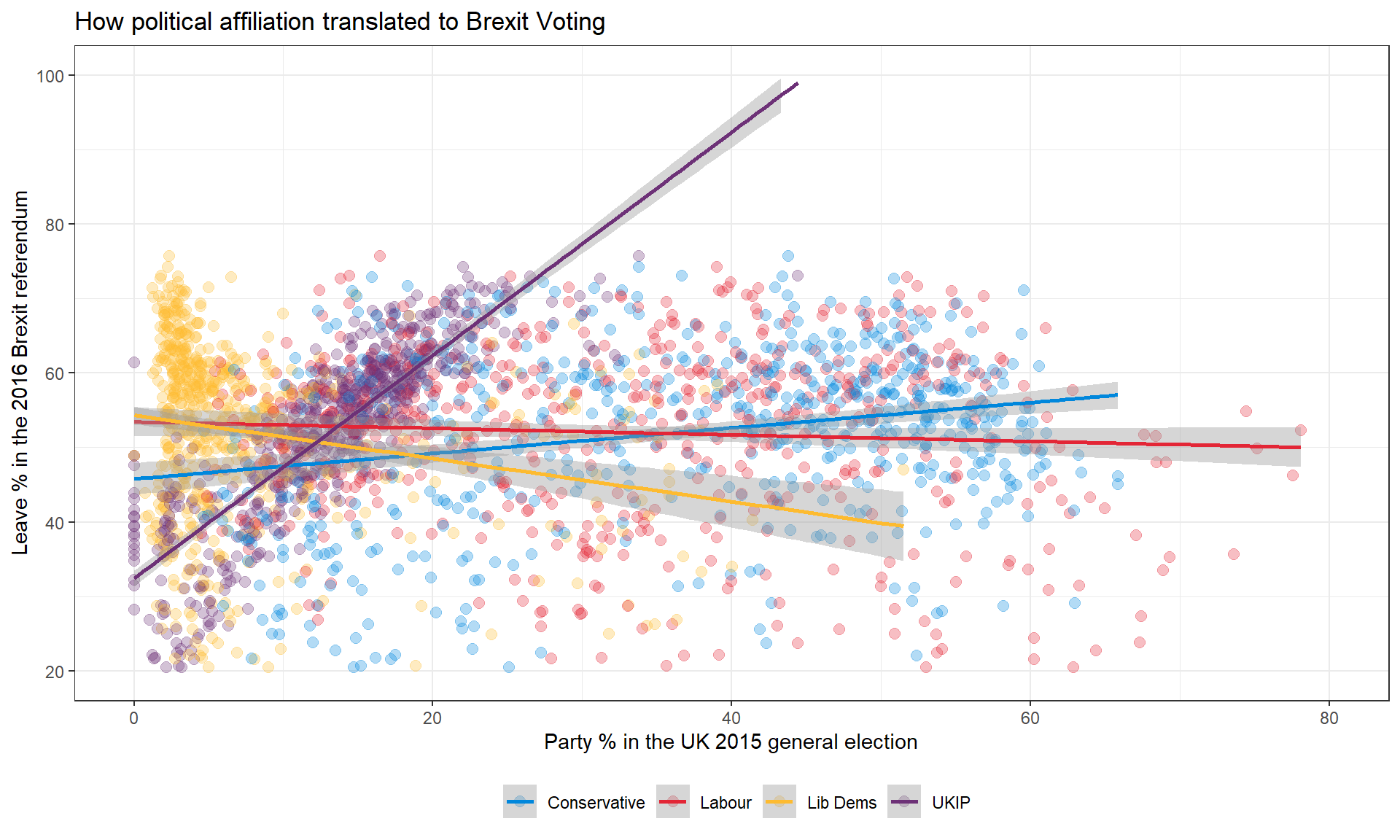
GDP components over time and among countries
The GDP data we will look at is from the United Nations’ National Accounts Main Aggregates Database, which contains estimates of total GDP and its components for all countries from 1970 to today.
UN_GDP_data  <-  read_excel(here::here("data", "Download-GDPconstant-USD-countries.xls"), # Excel filename
                sheet="Download-GDPconstant-USD-countr", # Sheet name
                skip=2) # Number of rows to skip
tidy_GDP_data <- UN_GDP_data %>%
pivot_longer(cols = 4:51,
names_to = "year",
values_to = "value") %>%
# Turning the selected columns' data type into dbl
mutate(year = as.double(year),value = as.double(value),
value = value/1e9)
glimpse(tidy_GDP_data)## Rows: 176,880
## Columns: 5
## $ CountryID <dbl> 4, 4, 4, 4, 4, 4, 4, 4, 4, 4, 4, 4, 4, 4, 4, 4, 4, 4, 4,…
## $ Country <chr> "Afghanistan", "Afghanistan", "Afghanistan", "Afghanista…
## $ IndicatorName <chr> "Final consumption expenditure", "Final consumption expe…
## $ year <dbl> 1970, 1971, 1972, 1973, 1974, 1975, 1976, 1977, 1978, 19…
## $ value <dbl> 5.56, 5.33, 5.20, 5.75, 6.15, 6.32, 6.37, 6.90, 7.09, 6.…# Let us compare GDP components for these 3 countries
country_list <- c("United States","India", "Germany")tidy_GDP_data %>%
filter(Country %in% country_list,
IndicatorName %in% c("Gross capital formation",
"Exports of goods and services",
"General government final consumption expenditure",
"Household consumption expenditure (including Non-profit institutions serving households)",
"Imports of goods and services")) %>%
ggplot(aes(x = year, y = value,color = IndicatorName))+
geom_line(size = 1)+
facet_wrap(~Country)+
scale_color_discrete(labels = c("Gross capital formation",
"Exports","Government expenditure",
"Household expenditure","Imports"))+
labs(title="GDP components over time",
subtitle = "In constant 2010 USD",
x= NULL,
y = "Billion US$",
color = "Components of GDP")+
theme_bw()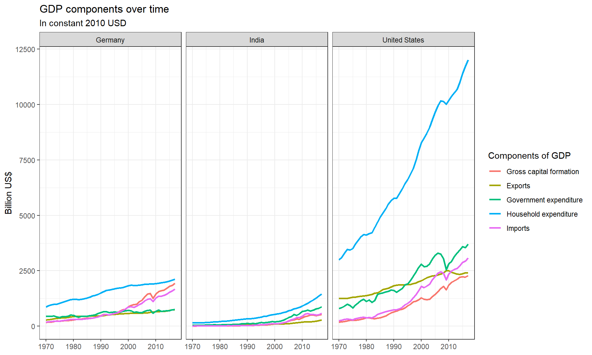
tidy_GDP_recalc <- tidy_GDP_data %>%
 filter(Country %in% country_list,
        IndicatorName %in% c("Gross capital formation",
                             "Exports of goods and services",
                             "General government final consumption expenditure",
                             "Household consumption expenditure (including Non-profit institutions serving households)",
                             "Imports of goods and services",
                             "Gross Domestic Product (GDP)")) %>%
 mutate(value = value / 10^9) %>%
 # pivot the data set wider so that the types show in different columns
 pivot_wider(names_from = IndicatorName,values_from = value) %>%
 # calculate the net export, total GDP and difference between given and calculated GDP
 mutate(Net_Exports = `Exports of goods and services` - `Imports of goods and services`,
        GDP_recalc = `Gross capital formation` + `General government final consumption expenditure`+
         `Household consumption expenditure (including Non-profit institutions serving households)`+
          Net_Exports,
        GDP_diff = formattable::percent(`GDP_recalc`-`Gross Domestic Product (GDP)`)/`GDP_recalc`)

# Show percentage change
tidy_GDP_recalc %>%
  select(Country, year, GDP_diff)
## # A tibble: 144 × 3
## Country year GDP_diff
## <chr> <dbl> <formttbl>
## 1 Germany 1970 2.94%
## 2 Germany 1971 3.42%
## 3 Germany 1972 3.43%
## 4 Germany 1973 2.84%
## 5 Germany 1974 1.75%
## 6 Germany 1975 2.84%
## 7 Germany 1976 2.76%
## 8 Germany 1977 2.69%
## 9 Germany 1978 2.96%
## 10 Germany 1979 3.33%
## # … with 134 more rows
## # ℹ Use `print(n = ...)` to see more rowstidy_GDP_recalc %>%
# pivot the indicator names longer, leaving GDP as a column
pivot_longer(col = c(4,5,6,10),names_to = "IndicatorName",values_to = "value") %>%
# Calculate the proportion
mutate(proportion = value / GDP_recalc) %>%
ggplot(aes(x = year, y = proportion,color = IndicatorName))+
geom_line(size = 1)+
facet_wrap(~Country)+
scale_color_discrete(labels = c("Government Expenditure",
"Gross capital formation",
"Household Expenditure",
"Net Exports"))+
labs(title="GDP and its breakdown at constant 2010 prices in US Dollars",
x= NULL,
y = "proportion",
caption = "\nSource: United Nations, http://unstats.un.org/unsd/snaama/Downloads",color = NULL)+
scale_y_continuous(labels = scales::percent)+
theme_bw()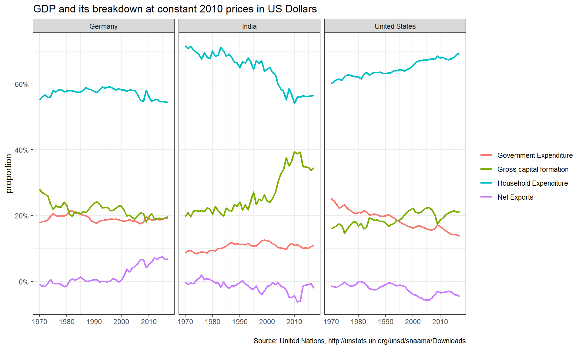
To commence our analysis, we would like to look at the similarities between the countries. It is clearly visible that household expenditure is by far the highest contributor to GDP in all countries. This is perfectly expected in general economics. For the remaining the parts of the GDP, the order of magnitude of their contribution is also approximately the same for all countries. India and USA share a trade deficit for most of the years. This might be tracked back to China, the largest importer for both USA and India. Especially for Germany and the USA, we can see that the components of the GDP comprise approximately the same percentage respectively. This is to be expected, as these countries are considered developed countries of similar economy and society, generally speaking. India however is a completely different story.
The first thing that becomes apparent is that India has visibly lower government expenditure than the comparison countries. This is not unusual for low-income countries, as they spend less on things such as social protection, health care and unemployment benefits. Nevertheless, India´s government expenditure is still within a reasonable margin and has increased in recent years. Another interesting finding is the continual percentage contribution decrease in household expenditure since 1970. An explanation is quickly found, as we can observe gross capital formation mirroring the change in reverse. We can deduct that the Indian population is investing more of their disposable income into assets, rather than spending it. It would prove interesting to identify the precise reason for this shift.
The USA also displayed a shift of components, however here it concerns government expenditure and capital formation. The shift might be attributed largely to the government adapting their spending policy, investing more heavily in infrastructure and military machinery than intangible benefits for the public. As we can also see, the USA is the only country for which the proportion of household expenditure follows has a positive slope. With the simultaneously increasing trade deficit, we can assume that US citizens increased their spending of foreign goods. This could be related to improving trade routes with China and Europe, as well as the rise of eCommerce in the later years. Of course, we also see a significant drop in gross capital formation around the time of the 2008 financial crisis, which also seems to have affected imports.
Last but not least, let us look at Germany. Looking at the visualization of the data, we see the most stable distribution of GDP components over the years between the three countries. Germany has been able to reliably maintain a trade surplus over most years. Especially since 2000, trade seems to have become more central to Germany´s GDP. Such an observation is not entirely surprising, giving that Germany has a strong footing in most large sectors (e.g. agriculture, pharma) and enjoys strong demand for its machinery and vehicles. Meanwhile, household expenditure contributes less to the GDP than observed in the other countries. This does not mean that Germans spend less, but that the GDP of Germany is just more evenly distributed between its components.
Rents in San Francsisco 2000-2018
# download directly off tidytuesdaygithub repo

rent <- readr::read_csv('https://raw.githubusercontent.com/rfordatascience/tidytuesday/master/data/2022/2022-07-05/rent.csv')
The data is separated into both characters and numbers. At first look, the data types seem to be correctly allocated given the nature of the variables. As for completeness, the most missing value is the description with 197,542 missing. However, details and location (address and coordinates) are closely behind. This is not very surprising, as people are both careful with publishing addresses on craigslist and lazy in writing detailed descriptions.
# Inspect the rent data
skimr::skim(rent)| Name | rent |
| Number of rows | 200796 |
| Number of columns | 17 |
| _______________________ | |
| Column type frequency: | |
| character | 8 |
| numeric | 9 |
| ________________________ | |
| Group variables | None |
Variable type: character
| skim_variable | n_missing | complete_rate | min | max | empty | n_unique | whitespace |
|---|---|---|---|---|---|---|---|
| post_id | 0 | 1.00 | 9 | 14 | 0 | 200796 | 0 |
| nhood | 0 | 1.00 | 4 | 43 | 0 | 167 | 0 |
| city | 0 | 1.00 | 5 | 19 | 0 | 104 | 0 |
| county | 1394 | 0.99 | 4 | 13 | 0 | 10 | 0 |
| address | 196888 | 0.02 | 1 | 38 | 0 | 2869 | 0 |
| title | 2517 | 0.99 | 2 | 298 | 0 | 184961 | 0 |
| descr | 197542 | 0.02 | 13 | 16975 | 0 | 3025 | 0 |
| details | 192780 | 0.04 | 4 | 595 | 0 | 7667 | 0 |
Variable type: numeric
| skim_variable | n_missing | complete_rate | mean | sd | p0 | p25 | p50 | p75 | p100 | hist |
|---|---|---|---|---|---|---|---|---|---|---|
| date | 0 | 1.00 | 2.01e+07 | 44694.07 | 2.00e+07 | 2.01e+07 | 2.01e+07 | 2.01e+07 | 2.02e+07 | ▁▇▁▆▃ |
| year | 0 | 1.00 | 2.01e+03 | 4.48 | 2.00e+03 | 2.00e+03 | 2.01e+03 | 2.01e+03 | 2.02e+03 | ▁▇▁▆▃ |
| price | 0 | 1.00 | 2.14e+03 | 1427.75 | 2.20e+02 | 1.30e+03 | 1.80e+03 | 2.50e+03 | 4.00e+04 | ▇▁▁▁▁ |
| beds | 6608 | 0.97 | 1.89e+00 | 1.08 | 0.00e+00 | 1.00e+00 | 2.00e+00 | 3.00e+00 | 1.20e+01 | ▇▂▁▁▁ |
| baths | 158121 | 0.21 | 1.68e+00 | 0.69 | 1.00e+00 | 1.00e+00 | 2.00e+00 | 2.00e+00 | 8.00e+00 | ▇▁▁▁▁ |
| sqft | 136117 | 0.32 | 1.20e+03 | 5000.22 | 8.00e+01 | 7.50e+02 | 1.00e+03 | 1.36e+03 | 9.00e+05 | ▇▁▁▁▁ |
| room_in_apt | 0 | 1.00 | 0.00e+00 | 0.04 | 0.00e+00 | 0.00e+00 | 0.00e+00 | 0.00e+00 | 1.00e+00 | ▇▁▁▁▁ |
| lat | 193145 | 0.04 | 3.77e+01 | 0.35 | 3.36e+01 | 3.74e+01 | 3.78e+01 | 3.78e+01 | 4.04e+01 | ▁▁▅▇▁ |
| lon | 196484 | 0.02 | -1.22e+02 | 0.78 | -1.23e+02 | -1.22e+02 | -1.22e+02 | -1.22e+02 | -7.42e+01 | ▇▁▁▁▁ |
Make a plot that shows the top 20 cities in terms of % of classifieds between 2000-2018. You need to calculate the number of listings by city, and then convert that number to a %.
# Group by city and count
rent %>%
  group_by(city) %>%
  count() %>%
  # count the rows with in a group and returns a new column n
  ungroup %>%
  mutate(pct_city = n/sum(n)) %>%
  # divided each group's number of rentals by the total amount(sum of all groups)
  slice_max(order_by=pct_city, n=20) %>%
  ggplot(aes(x=pct_city,y=fct_reorder(city,pct_city))) +
    geom_col()+
    labs(title="San Francisco accounts for more than a quarter of all rental classifieds",subtitle ="% of Craigslist listings, 2000-2018",x=NULL,y=NULL,caption = "Source: Pennington, Kate (2018). Bay Area Craigslist Rental Housing Posts,2010-2018")+
    theme_bw()+
    theme(panel.border = element_blank()) +
    theme(plot.title.position = "plot")+
    scale_x_continuous(labels = scales::percent) #Transform the x-axis label into percentage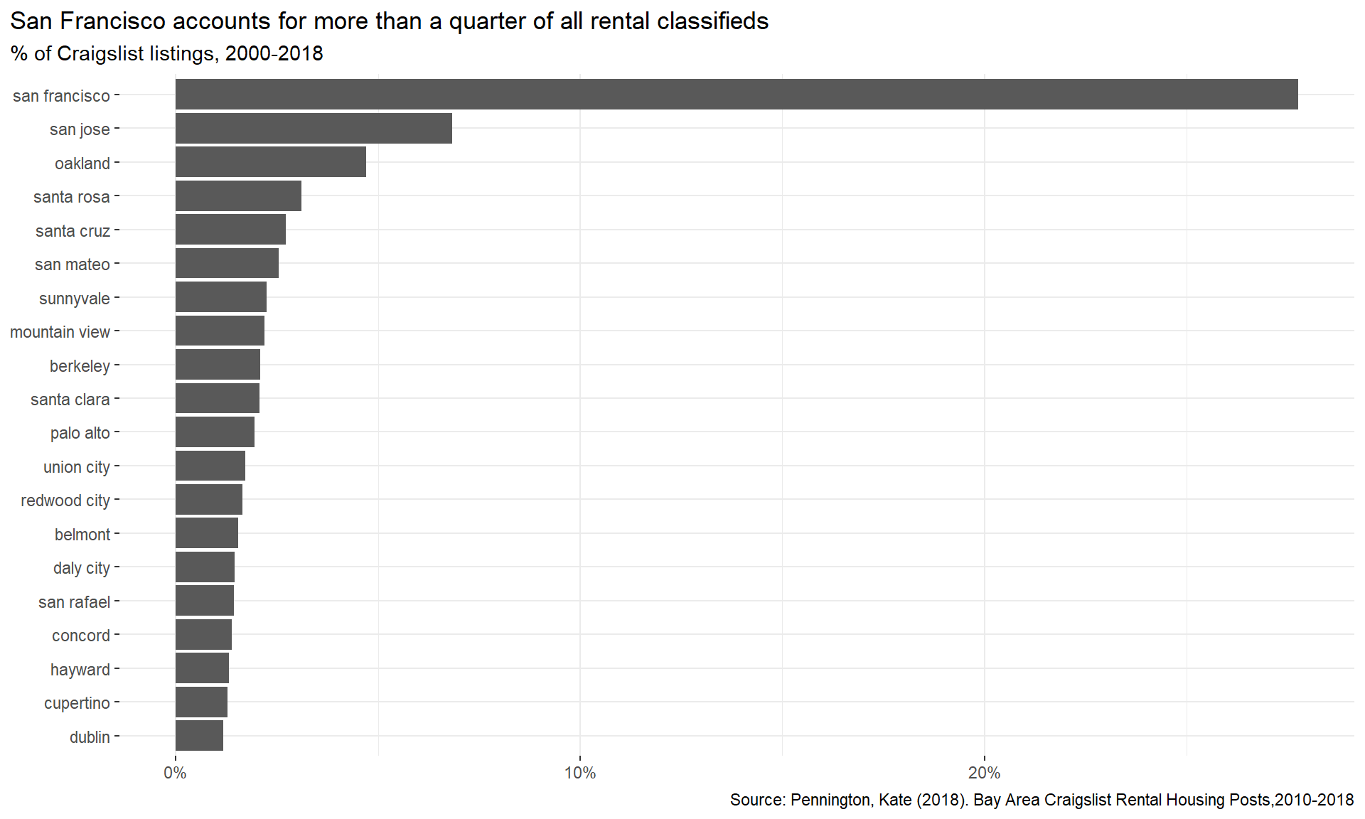
Make a plot that shows the evolution of median prices in San Francisco for 0, 1, 2, and 3 bedrooms listings.
rent %>%
  filter(city=="san francisco", beds %in% 0:3) %>%
  group_by(beds,year) %>%
  summarize(median_price=median(price)) %>%
  ggplot(aes(x=year,y=median_price,colour=factor(beds)))+
  geom_line()+
  labs(title="San Francisco rents have been steadily increasing",subtitle = "0 to 3-bed listings,  2000-2018",x=NULL,y=NULL,caption = "Source: Pennington, Kate (2018). Bay Area Craigslist Rental Housing Posts,2010-2018")+
  facet_wrap(~beds,nrow=1)+ #facet beds
  theme_bw()+ # change the theme as black-white
  theme(plot.title.position = "plot")+
  theme(legend.position = "none")+ # hide the legends
  scale_color_manual(values = c("red","green","blue","purple"))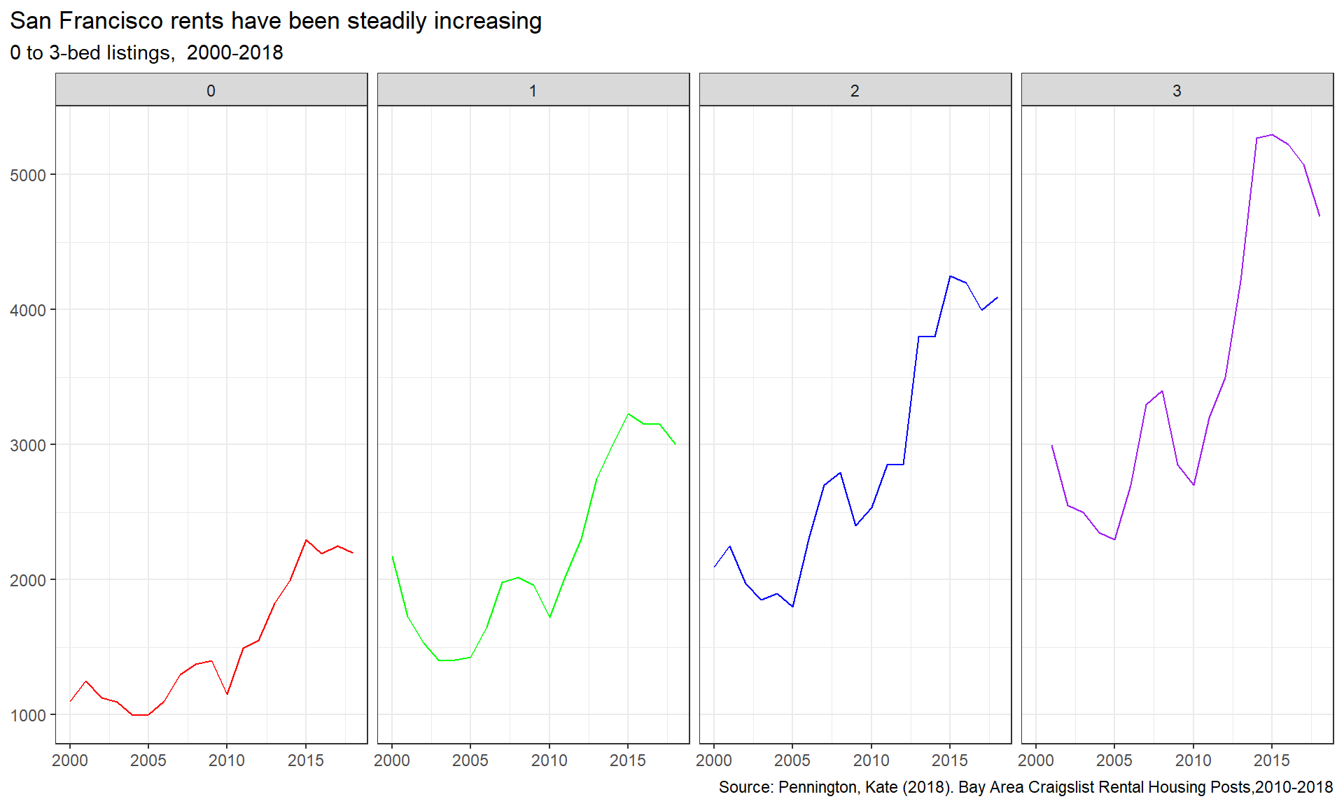
Finally, make a plot that shows median rental prices for the top 12 cities in the Bay area.
# find the top 12 cities
top_cities = rent %>%
  group_by(city) %>%
  count() %>%
  ungroup %>%
  mutate(percent = n/sum(n)) %>%
  slice_max(order_by=percent, n=12)

rent %>%
  filter(beds==1,
         city %in%  top_cities$city) %>% #filter out the cities with 1 bed
  group_by(city,year) %>%
  summarize(median_price=median(price)) %>%
  ggplot(aes(x=year,y=median_price,colour=city))+
  geom_line()+
  facet_wrap(~city,nrow=3)+
  theme_bw()+
  theme(plot.title.position = "plot")+
  labs(title="Rental prices for 1-bedroom flats in the Bay Area",x=NULL,y=NULL,caption = "Source: Pennington, Kate (2018). Bay Area Craigslist Rental Housing Posts, 2010-2018")+
  theme(legend.position = "none")# hide the legend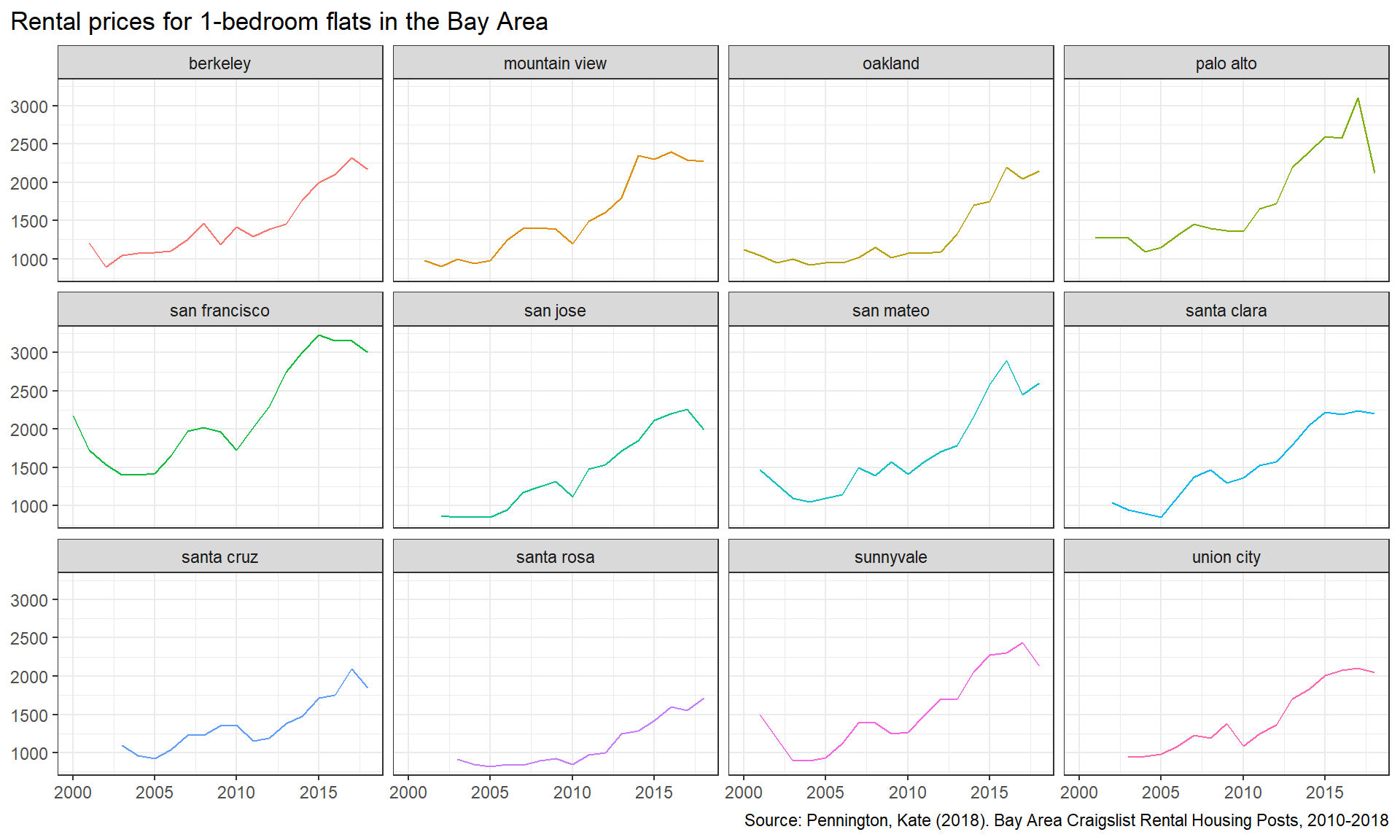
First of all, San Francisco has the most listings among all the cities it the Bay Area. The reason behind this could be that San Francisco has a booming economy and is a popular location for large companies, such as Uber or Twitter. These companies recruit a lot outside of San Francisco, leading to a large influx in individuals requiring local accommodation. As the demand is high, supply follows suit. Smaller towns like Redwood City have low population and don’t draw nearly as many foreign settlers. Therefore, the number of listings is comparatively lower.
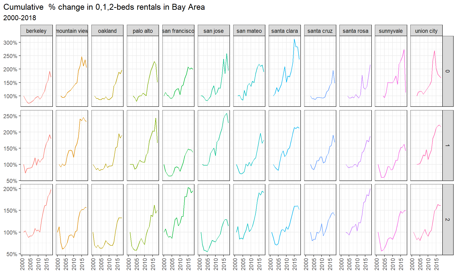
The increase in rental prices between 2000 and 2018 in San Francisco is proportionally approximately the same between 0 to 3 bed listings. If there was a larger increase in families over that time frame, we could potentially see prices for 2 and 3 bedroom flats ascending more extremely given the increase demand. However, the demand seems to be equally balanced between all sizes. We should also not be surprised to see generally higher prices in San Francisco compared to other cities in the Bay Area. This is most likely a result of the popularity of the city for foreigners and the limited space available for additional housing, among others. By observing the price line charts for all cities in the Bay Area, we can see that all have experienced a rise in prices between 2000 and 2018. A natural increase over time is to be expected, given inflation. However we see more pronounced increases in some areas versus others, the reasons for which could be further investigated. An example would be Palo Alto, which is of course known for the Stanford Campus. Last but not least, the dip in 2008/2009 is worth mentioning. This is most likely a result of the financial crisis during that time. The difference in the gravity of the dip between cities provides some intriguing insights.
Create a graph that calculates the cumulative % change for 0-, 1-1, and 2-bed flats between 2000 and 2018 for the top twelve cities in Bay Area, by number of ads that appeared in Craigslist.
rent %>%
  filter(beds %in% c(0,1,2),
         city %in% top_cities$city) %>%
  # Fielter out the right city with right number of beds
  group_by(city,beds,year) %>%
  arrange(year) %>%
  summarize(median_price=median(price))%>%
  # calculate the median price in each year in each group
  ungroup %>%
  group_by(city,beds) %>%
  mutate(initial_price=dplyr::first(na.omit(median_price))) %>%
  # Find the initial value (price in 2000) for each group(city:beds)
  mutate(cumulative_change=median_price/initial_price) %>%
  # cumulative change = current price / initial price
  ggplot(aes(x=year,y=cumulative_change,color=city))+
  geom_line()+
  facet_grid(beds~city,scales = "free_y")+ # facet by beds and city in grid
  scale_y_continuous(labels=scales::percent)+
  # change the y-axis lable into percentage
  theme_bw()+
  theme(axis.text.x = element_text(vjust = 0.5, hjust=1,angle =90))+
  theme(plot.title.position = "plot")+
  labs(title = "Cumulative  % change in 0,1,2-beds rentals in Bay Area",subtitle="2000-2018",x=NULL,y=NULL)+
  theme(legend.position  = "none")